-
Shop
- Advanced Technologies
- AI Skills for Creators & Freelancers
- AI Client Management
- AI Ethics
- AI Mindset
- AI Tools & Prompts
- AI Writing & Content Creation
- Audio, Voice & Music
- Design & Visual Creation
- Email, Messaging & Communication
- Freelancing & Business
- Marketing, Ads & Conversion
- Productivity, Workflow & Automation
- SEO & Search Optimization
- Social Media Content & Growth
- Strategy, Planning & Analytics
- Video Creation & Editing
- AI Skills Mastery 2026 Collection
- Bathroom
- Best-Sellers
- Car Accessories
- Confidence
- Dating & Social Skills
- Digital Resources
- Easter Products
- Education & Learning
- Family & Parenting
- Fashion
- Fashion Accessories
- Furniture
- Gadgets
- Health & Beauty
- Health & Wellness
- Home & Garden
- Home Electronics
- Home Supplies
- Jewelry
- Kids & Babies
- Kitchen
- Lighting
- Patio, Lawn & Garden
- Personal Growth
- Pet Care
- Pet Supplies
- Pets
- Shoes
- Smart Home Living Guides
- Sport & Outdoors
- Stress Relief & Relaxation
- Super Deals
- TikTok Growth & Monetization Mastery
- Travel
- Travel & Adventure
- Wealth
- Wellness
How to Refresh Dated Decor Without Starting Over
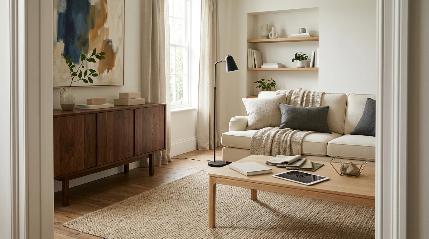
What Makes Decor Feel Dated (and What Doesn’t)
Most homes don’t feel “out of date” because one item is old. They feel dated when several visual cues stack up at once: a busy mix of patterns, heavy window treatments, overly themed accessories, shiny brass everywhere, or furniture silhouettes that instantly place the room in a specific era.
That said, “vintage” and “dated” aren’t the same thing. Quality materials (solid wood, real stone, well-made upholstery), classic proportions, and meaningful pieces can absolutely stay—especially when they’re paired with cleaner, simpler updates around them.
The fastest tell is breathing room. If every surface is filled with small décor, every finish is different, and nothing has space to “land,” the room reads older even when the pieces are new.
A Quick Diagnostic: Walk-Through Checklist Before You Buy Anything
Before ordering a cart full of new décor, do a fast scan that turns “something feels off” into clear next steps.
- Take photos from the doorway and from each corner. Seeing your room flattened into an image makes dated elements jump out.
- Label what you see as: Keep, Move (to another room), Replace, or Store (for later/seasonal).
- Count finishes: metals, woods, paint tones, and textile colors. Too many variations usually look accidental.
- Identify the anchors (sofa, bed, dining table, main rug). If an anchor fights your desired look, the room will always feel “in between.”
- Choose one modern direction per room—warm modern, organic modern, minimalist, or transitional—so the results feel intentional.
Fast Room Scan: What to Update First
| Area | Common dated cue | High-impact update | Difficulty |
|---|---|---|---|
| Walls | Yellowed paint or strong themed colors | Neutral paint or a controlled accent wall | Low |
| Lighting | Builder-grade fixtures, overly ornate styles | Simple modern fixture + warmer bulbs | Low–Medium |
| Windows | Heavy valances, busy curtains | Clean panels, woven shades, or minimal hardware | Low |
| Surfaces | Cluttered collections everywhere | Group decor into fewer, larger moments | Low |
| Textiles | Matchy-matchy sets, tiny prints | Larger-scale patterns + solid layers | Low |
| Furniture | Overstuffed shapes or dated finishes | Swap legs/hardware, reupholster, or replace one anchor | Medium–High |
Modernizing Without Starting Over: The “Keep, Edit, Upgrade” Method
This method prevents the two common mistakes: replacing things that were fine, and keeping the loudest dated elements because they seem “too hard” to change.
- Keep: Hold onto pieces with good scale, comfort, and quality—especially neutral upholstery and timeless silhouettes.
- Edit: Reduce duplicates (extra frames, too many small vases, multiple tiny lamps). Leave negative space on shelves so the room feels calmer and more current.
- Upgrade: Refresh what’s visually loud first. Paint, lighting, and textiles often change the entire mood faster than swapping furniture.
- Aim for cohesion: Repeat 2–3 finishes across the room (example: matte black + warm brass + light oak) rather than mixing everything once.
- Use contrast on purpose: Pair older wood tones with cleaner modern shapes, or add modern art to balance classic furniture.
Design choices also affect how a home feels day to day. If you want a calmer, more supportive space, it helps to simplify visual noise and create a clear “order” to the room—an approach that aligns with what’s known about the relationship between environment and well-being (American Psychological Association).
Room-by-Room Priorities for a Noticeable Lift
Living Room
Start with lighting and rug scale (rugs are often too small). Then simplify the coffee table and mantel: fewer items, larger shapes, and one strong focal point (art or a mirror) creates instant polish.
Bedroom
Kitchen
Bathroom
Entryway
Small Updates That Read “Modern” Immediately
- Paint: Warm whites, soft greiges, and muted earth tones tend to feel current. Very cool grays can look flat in low-light homes.
- Lighting temperature: Use consistent warm bulbs (often 2700K–3000K) so finishes and textiles look richer. For practical guidance on efficient lighting choices, see the U.S. Department of Energy.
- Window treatments: Hang curtains higher and wider to make ceilings feel taller. Choose solid, textured fabrics to reduce the “busy” effect.
- Art: Larger-scale pieces (or a curated pair) read more intentional than many small scattered frames.
- Styling rule: One tall vase, a short stack of books, and one sculptural object often looks cleaner than ten mini knickknacks.
Avoiding Common Makeover Mistakes
A Printable Plan for Moving From “Dated” to “Updated”
A guided approach turns vague frustration into clear next steps: diagnose what’s dated, choose a direction, and follow a simple room-by-room sequence. If you want a structured walkthrough with printable checklists and an easy makeover order, use the Refreshing Your Dated Home Decor digital guide and printable checklist.
Small, practical add-ons for a “cleaner” daily routine
- For a tidier-looking bathroom counter, consider replacing mismatched items with streamlined essentials like the Triple-Sided Ultra-Fine Soft Bristle Toothbrush for Enhanced Oral Health.
- If your entry or mudroom becomes a drop zone because the car is disorganized, a simple organizer upgrade like the Universal Car Steering Wheel Phone Mount for Safe Navigation can reduce daily clutter creep.
FAQ
How can decor be updated on a small budget?
Focus on paint, lighting and bulbs, decluttering, and textiles like curtains, pillows, and bedding. Make one intentional anchor change per room before adding more decor so the updates look cohesive.
What should be replaced first when a room looks dated?
Start with the highest-visibility items that set the tone: lighting fixtures, wall color, window treatments, and the main rug size and placement. These changes typically deliver the biggest visual lift without replacing everything.
How do you mix older furniture with modern decor so it looks intentional?
Repeat 2–3 finishes across the room, simplify accessories, and add modern lighting and art. Balance silhouettes by pairing classic furniture with clean-lined accents so the contrast feels deliberate.
Recommended for you


Was this article helpful?
Yes
No







Leave a comment