-
Shop
- Advanced Technologies
- AI Skills for Creators & Freelancers
- AI Client Management
- AI Ethics
- AI Mindset
- AI Tools & Prompts
- AI Writing & Content Creation
- Audio, Voice & Music
- Design & Visual Creation
- Email, Messaging & Communication
- Freelancing & Business
- Marketing, Ads & Conversion
- Productivity, Workflow & Automation
- SEO & Search Optimization
- Social Media Content & Growth
- Strategy, Planning & Analytics
- Video Creation & Editing
- AI Skills Mastery 2026 Collection
- Bathroom
- Best-Sellers
- Car Accessories
- Confidence
- Dating & Social Skills
- Digital Resources
- Easter Products
- Education & Learning
- Family & Parenting
- Fashion
- Fashion Accessories
- Furniture
- Gadgets
- Health & Beauty
- Health & Wellness
- Home & Garden
- Home Electronics
- Home Supplies
- Jewelry
- Kids & Babies
- Kitchen
- Lighting
- Patio, Lawn & Garden
- Personal Growth
- Pet Care
- Pet Supplies
- Pets
- Shoes
- Smart Home Living Guides
- Sport & Outdoors
- Stress Relief & Relaxation
- Super Deals
- TikTok Growth & Monetization Mastery
- Travel
- Travel & Adventure
- Wealth
- Wellness
Furniture Placement Basics: Layouts for Better Flow
Furniture Placement Basics: A Simple Digital Guide to Room Layouts and Better Flow
A room can look beautifully decorated and still feel “off” if the layout works against how people actually move, sit, and use the space. The good news: furniture placement isn’t guesswork. With a few repeatable steps—defining function, measuring, choosing a focal point, planning pathways, and balancing scale—you can make living rooms, bedrooms, dining areas, and multipurpose spaces feel calmer, easier to navigate, and more comfortable day to day.
Start With Function: What the Room Needs to Do
Before shifting a single chair, get clear on what the room is for. A layout that supports the room’s real job will always feel better than one that simply fills corners.
- List the room’s primary uses (conversation, TV viewing, reading, dining, work, play) and rank them.
- Identify who uses the space most and what frustrates them (blocked walkways, no surfaces, glare, cramped seating).
- Decide the “must-keep” items and what can be replaced, resized, or moved to another room.
- For multifunction rooms, assign zones (example: lounge + desk corner) before moving furniture so the layout supports both uses.
A fast check: if a room needs to do two things, give each function a “home.” That can be as simple as a reading chair and lamp in one corner and a conversation/TV zone in another—without either zone interrupting the other’s pathways.
Measure First: Room, Furniture, and Clearance
Measurements turn rearranging from a heavy workout into a quick planning exercise. Start with the shell of the room, then the footprint of what goes inside it.
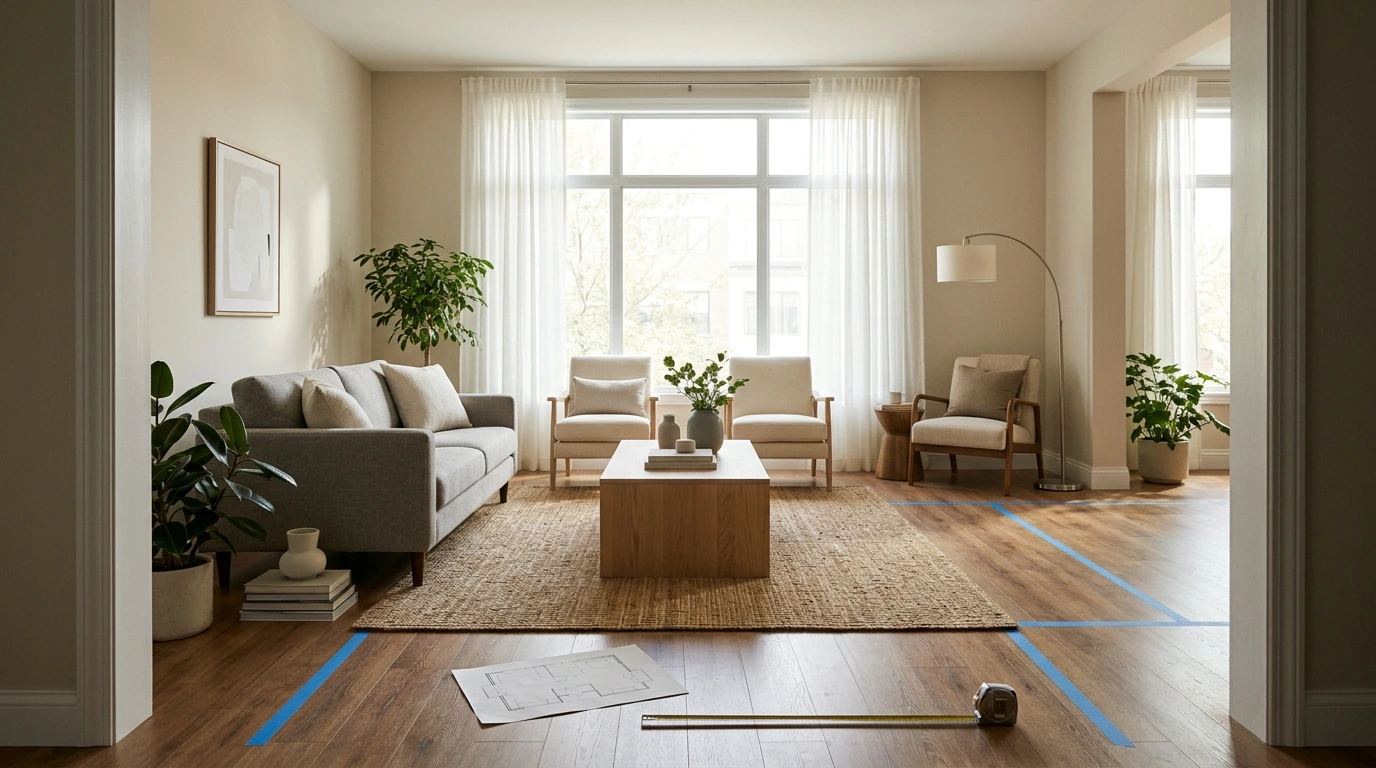
- Measure wall lengths, door swings, windows, built-ins, vents, radiators, and outlets; sketch a quick floor plan.
- Measure key furniture pieces (sofa length/depth, table diameter, bed size, dresser depth).
- Use painter’s tape or paper cutouts to test footprints on the floor before lifting heavy items.
- Keep clearances in mind: comfortable walking paths, chair pull-back space, and door access.
Common Clearances That Improve Comfort
| Area | Recommended clearance | Why it helps |
|---|---|---|
| Main walkway | 30–36 in (76–91 cm) | Prevents bottlenecks and makes the room feel easy to navigate |
| Secondary path (less used) | 24–30 in (61–76 cm) | Maintains flow without wasting space |
| Coffee table to sofa/chairs | 14–18 in (36–46 cm) | Easy reach while still allowing legroom |
| Dining chair pull-back | 36 in (91 cm) behind chairs | Allows sitting/standing without collisions |
| Bed side clearance (one side) | 24–30 in (61–76 cm) | Comfortable entry and making the bed |
For accessibility-minded spacing, it can help to reference the ADA Standards for Accessible Design as a reality check—especially in tight entries, hall-like living rooms, or homes where wider turning space matters.
Choose a Focal Point and Build Around It
A focal point gives the room a “north star” so furniture doesn’t drift into random placement. It also clarifies where seating and sightlines should aim.
- Pick the strongest anchor: fireplace, large window view, media wall, statement art, or the bed in a bedroom.
- Arrange the largest seating (or the bed) to acknowledge the focal point without blocking light or traffic.
- Give the focal area breathing room—cleaner sightlines almost always make a room feel larger.
- If you have competing focal points (TV + fireplace), prioritize what you use daily and soften the other with balanced decor.
When the TV is the daily focal point, aim for a comfortable viewing angle and avoid placing screens directly opposite bright windows. If glare is unavoidable, plan for light control (shades, curtains) as part of the layout—not as an afterthought.
Create Flow With Pathways, Not Just “Against the Wall” Placement
Many awkward rooms share the same issue: furniture blocks natural routes. Instead of defaulting to lining everything up along walls, start with the way people enter, cross, and settle into the space.
Balance Scale and Proportion: The Fast Visual Checks
Room-by-Room Layout Templates (Easy Starting Points)
Living room
TV room
Bedroom
Dining area
Small spaces
Finishing Touches That Make a Layout Feel Intentional
For additional planning fundamentals (especially around work zones and clearances), the National Kitchen & Bath Association (NKBA) Planning Guidelines are a helpful reference for how professionals think about function-first layouts.
A Handy Digital Guide for Confident Furniture Placement
If you want a quick reference you can use while measuring and testing options, Furniture Placement Basics eBook (digital download) lays out practical steps and clear guidelines for creating better flow. It’s useful for rearranging what you already own, moving into a new space, or troubleshooting a room that feels tight despite “enough” square footage.
Optional add-ons for the planning-and-moving day
- Armani Exchange Men’s Sneakers for steadier footing when you’re walking the room, measuring, and shifting furniture.
- Universal Car Steering Wheel Phone Mount for Safe Navigation to keep directions visible hands-free while sourcing supplies or coordinating move-day logistics.
FAQ
How much space should be left for walkways in a room?
Aim for 30–36 inches for main walkways and 24–30 inches for secondary paths. In very small rooms you can tighten slightly, but keep routes safe, clear of door swings, and easy to navigate without turning sideways.
Should a sofa be placed against the wall?
It works in tight rooms when wall-hugging placement protects a main walkway or keeps doors clear. If space allows, pulling the sofa forward often improves conversation distance, creates room for a console or lamp behind it, and makes the layout feel more intentional.
How can a small room feel more open without removing furniture?
Protect clear pathways first, then choose leggy pieces and lighter silhouettes so the floor is more visible. A properly sized rug that unifies the seating area, plus layered lighting (not just one overhead), can make the same square footage feel noticeably airier.
Recommended for you

Was this article helpful?
Yes
No






Leave a comment