-
Shop
- Advanced Technologies
- AI Skills for Creators & Freelancers
- AI Client Management
- AI Ethics
- AI Mindset
- AI Tools & Prompts
- AI Writing & Content Creation
- Audio, Voice & Music
- Design & Visual Creation
- Email, Messaging & Communication
- Freelancing & Business
- Marketing, Ads & Conversion
- Productivity, Workflow & Automation
- SEO & Search Optimization
- Social Media Content & Growth
- Strategy, Planning & Analytics
- Video Creation & Editing
- AI Skills Mastery 2026 Collection
- Bathroom
- Best-Sellers
- Car Accessories
- Confidence
- Dating & Social Skills
- Digital Resources
- Easter Products
- Education & Learning
- Family & Parenting
- Fashion
- Fashion Accessories
- Furniture
- Gadgets
- Health & Beauty
- Health & Wellness
- Home & Garden
- Home Electronics
- Home Supplies
- Jewelry
- Kids & Babies
- Kitchen
- Lighting
- Patio, Lawn & Garden
- Personal Growth
- Pet Care
- Pet Supplies
- Pets
- Shoes
- Smart Home Living Guides
- Sport & Outdoors
- Stress Relief & Relaxation
- Super Deals
- TikTok Growth & Monetization Mastery
- Travel
- Travel & Adventure
- Wealth
- Wellness
Confident Pattern Mixing: Color, Scale & Easy Formulas
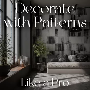
How to Decorate with Patterns Like a Pro: A Practical Guide to Confident Pattern Mixing
Pattern mixing can make a room feel layered, intentional, and personal—without looking busy. The key is structure: a clear color plan, a balanced mix of scales, and a few reliable “rules” that still leave room for creativity. Use the steps below to build combinations that look curated from the start, whether styling a sofa, bedding, walls, or a full room.
Start with a simple pattern framework
If pattern mixing feels intimidating, simplify the decision-making. Instead of choosing ten prints at once, build a small system that repeats across rooms.
- Choose one “anchor” pattern that sets the mood (floral, stripe, geometric, plaid, abstract).
- Add a supporting pattern that relates to the anchor through color or motif.
- Finish with a low-contrast “neutral pattern” (pinstripe, small check, tonal texture) to calm the mix.
- Aim for 3–5 patterns in a room; beyond that, repeat colors and vary scale to avoid visual noise.
Quick pattern-mixing formulas (swap pieces as needed)
| Formula | Anchor | Support | Neutral/Texture | Best for |
|---|---|---|---|---|
| Classic Contrast | Bold stripe | Medium floral | Tonal linen texture | Living rooms, entryways |
| Soft Layered | Large watercolor floral | Small dot | Herringbone or bouclé | Bedrooms, reading nooks |
| Modern Graphic | Oversized geometric | Thin stripe | Solid + ribbed knit | Offices, minimalist homes |
| Heritage Cozy | Plaid or tartan | Toile or block print | Small check | Cabins, traditional spaces |
Build a color plan that keeps everything cohesive
Color is the glue that makes different patterns look like they belong together. When in doubt, reduce the number of colors before reducing the number of patterns.
- Pick 2–3 main colors and 1 accent; repeat them across patterns so the room reads as one story.
- Use one “bridge color” that appears in every pattern (even in tiny amounts, like a thin outline or small motif).
- Limit high-saturation colors to one or two items; let the rest be softer or more muted.
- If patterns feel too loud, reduce contrast (choose patterns with closer values—light/dark levels) before removing patterns.
To sharpen your eye for how color behaves side-by-side, it helps to revisit fundamentals like the Josef Albers Foundation’s “Interaction of Color”. Even small shifts in surrounding color can make the same pattern look calmer or more intense.
Master scale: the easiest way to look intentional
Scale is often the “missing piece” when a room feels busy. Two gorgeous prints can clash simply because they’re fighting for attention at the same size.
- Mix at least three scales: large (statement), medium (support), small (texture).
- Put large-scale patterns on bigger surfaces (rug, drapery, duvet) and small-scale patterns on accents (pillows, throws).
- If two patterns compete, change the scale of one rather than changing the style.
- Repeat a scale once (e.g., two small patterns) only if their motifs are different and the colors match.
A practical check: if you squint and everything turns into the same “visual noise,” you likely need a stronger scale difference (or a calmer solid) to separate layers.
Combine pattern “types” for a designer mix
Designers often mix patterns by balancing opposites. You can do the same by pairing organic shapes with structured lines.
- Pair organic with structured (floral/botanical with stripe/grid) for balance.
- Use stripes as a “visual neutral” that plays well with most prints.
- Add one pattern with strong negative space (more background showing) to give the eye a rest.
- Keep one element consistent: either motif family (all geometrics) or a consistent color palette across different motifs.
If you want a quick refresher on the building blocks behind why certain combinations feel balanced, the Getty’s overview of the basic elements of design is a useful reference for concepts like line, shape, value, and texture.
Use solids, texture, and spacing as the secret weapons
Pattern mixing isn’t only about prints. What you don’t pattern matters just as much as what you do.
- Solid colors create breathing room between busy prints—especially on large upholstery pieces.
- Texture counts as pattern: bouclé, rattan, ribbed knits, grasscloth, and woven rugs add depth without adding more color.
- Leave one calm surface per zone (a plain wall, solid sofa, or simple bedding layer).
- Create spacing: cluster patterns in one area (sofa + pillows) and keep nearby items simpler (side chairs, lampshade).
Think of spacing like punctuation. A bold rug and bold drapes can work together—if the sofa, walls, and key casegoods give your eye a place to land.
Room-by-room pattern placement that feels balanced
Living room
- Start with rug or pillows as the anchor.
- Keep the sofa solid if the rug is bold, or flip that if the rug is neutral.
Bedroom
Dining area
Small spaces
Common pattern-mixing mistakes (and quick fixes)
A step-by-step pattern mixing mini project (15 minutes)
Helpful picks
- How to Decorate with Patterns Like a Pro | Interior Design Guide | Digital Download Home Styling eBook | Pattern Mixing Tips for Decor Lovers
- Armani Exchange Men’s Sneakers (a comfortable option for long days browsing home stores, vintage markets, and fabric shops)
FAQ
How many patterns should be in one room?
Three to five patterns is a comfortable range for most rooms. Use an anchor, a supporting pattern, and a quieter neutral/texture, then repeat colors and vary scale so the mix feels calm instead of crowded.
What patterns go together best?
Pair one organic motif (like a floral) with one structured pattern (like a stripe or grid), then add a small check or tonal texture to soften the transitions. Shared colors and similar light/dark values help different prints feel like a set.
How can pattern mixing look cohesive in a small space?
Use fewer patterns, go bigger in scale, and rely on solids and texture to create breathing room. One dramatic print plus two quiet layers (like a stripe and a tonal texture) typically reads more intentional than many tiny, high-contrast prints.
Recommended for you


Was this article helpful?
Yes
No








Leave a comment